Procore Locations
I proposed, tested and redesigned the flow to get to locations and view what is happening and has happened in a location.
Project details
Client
Procore
2024
Skills
Product Design, Research
"Diego has demonstrated solid skills and dedication, significantly contributing to Procore design projects. Deliverables have consistently been of high quality considering design guidelines, time windows and team requirements"
Karen Fojas
Product Design Leader @Procore
Overview
Procore is dedicated to construction and construction alone. Their products are intuitively designed to help builders maximize ROI.
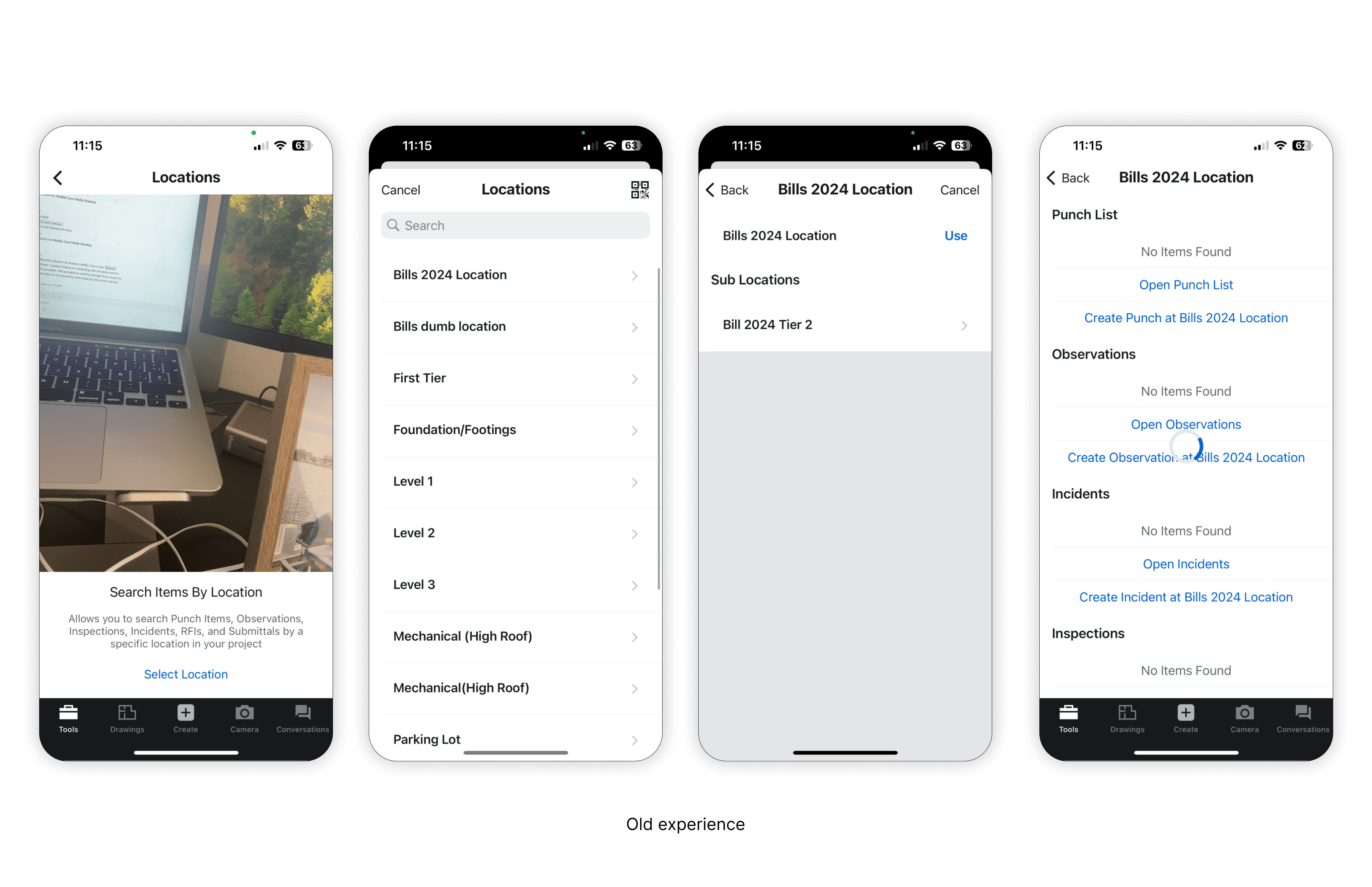
For this particular project, users need a highly intuitive way to manage, visualize, and interact with work items related to specific locations. The current Locations Tool is functional but lacks the visual and interactive elements that can significantly enhance their efficiency.
Jobs to be done
Understanding where work has been completed, where it needs to be completed, and what might be blocking progress in a particular place is critical to improving Procore’s ability to track progress on the job site.
We wanted to understand if drawings was a crucial piece for them to navigate to a location, knowing the boundaries and relationship between these locations and where they are placed in the building. We brought this up very prominently.
We put a prototype together to run an unmoderated test, gathering people's reactions to this new experience.
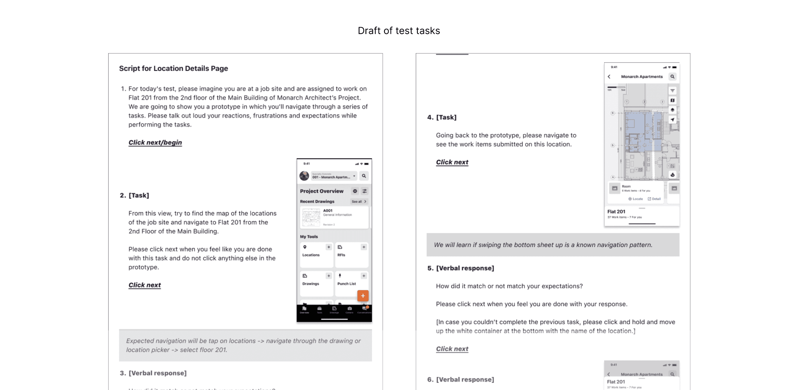
When it comes to getting to a location, we thought the drawings were preferred. Now, to get to a work item assigned to them, we had 3 options:
Collapsable groups to get to a work item group quickly without scrolling.
Filters in case we didn't have the ability to only show items you are assigned vs everybody.
Carousel for the same reason as filters but having a different treatment. Maybe looking at the name of the category invites you to tap on it to see the related items.

Our findings
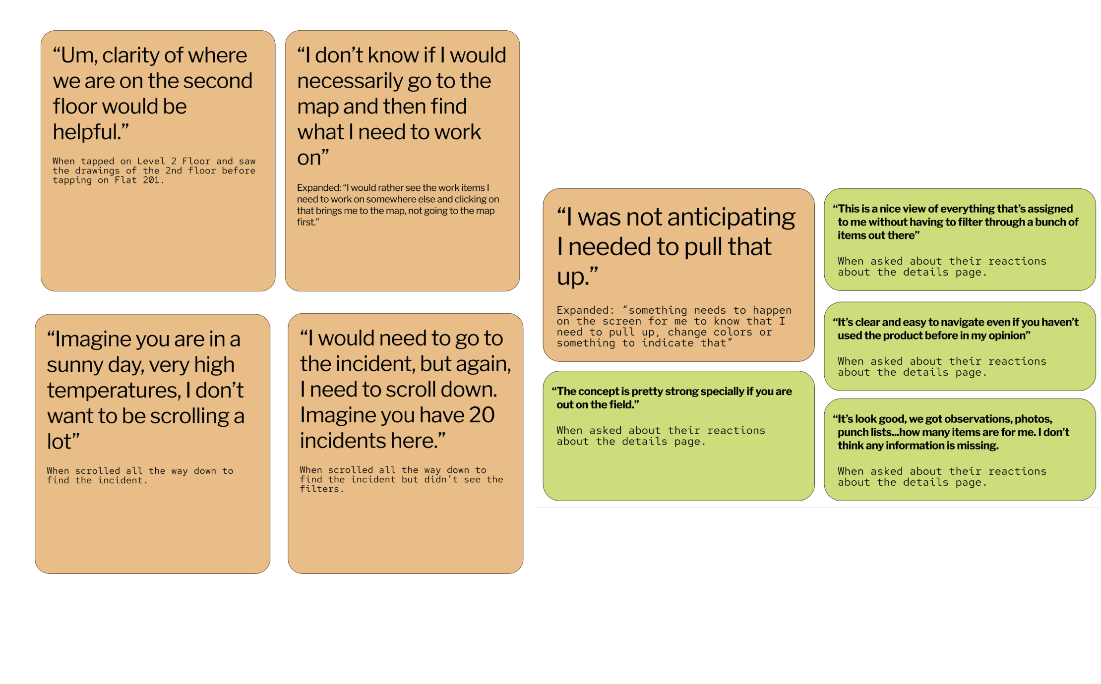
At a high level, people struggled to find a work item within the location details page since it was not clear how to get access to this page.
Participants didn’t use the drawings navigation to find a location. Picker was more intuitive.
Participants were confused to identify which was the locations details page.
Collapsable groups for showing work items is quicker and preferable by participants since they avoid scrolling too much.
We went back to the drawing board to continue iterating on the designs. Our hypothesis was not entirely true and we learned participants preferred to use the picker to get to a location. Even though we wanted to make the drawing a secondary way of navigating to a location, we had several options for it.
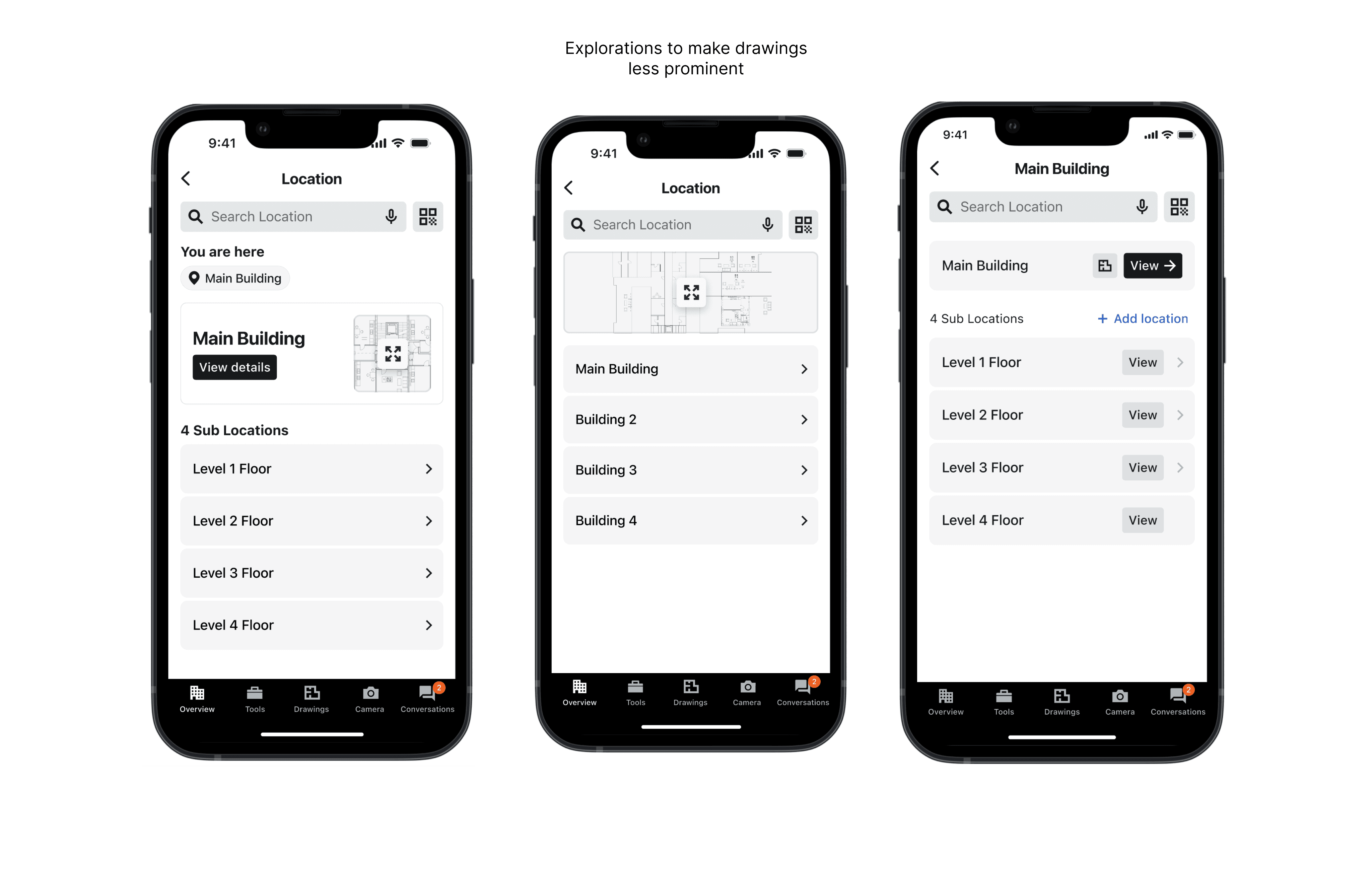
We made the picker more prominent as a way to get access to a location. Drawing is secondary.
We Improved the button to view the location's details to make sure they understand they are different views.
We kept the collapsable groups to view work items in a location. Based on time constraints, items assigned to you were removed from scope and the groups show most recent with the option for you to see all and filter in the work item's respective tool/screen.

This project is under development and hope to share results soon!