Eskalera's Design System
Skale is Eskalera's set of standards to manage design at scale by reducing redundancy while creating a shared library and visual consistency across different pages and platforms. I had the responsibility of ensuring that the design system helped the team move faster.
Project details
Client
Eskalera
2023
Skills
Lead Designer
"Diego took a validated and functional product with an MVP design, and turned it into a beautiful and modern interface ready for the enterprise. He managed the always varying (and sometimes loud) opinions of numerous stakeholders on the product, engineering, sales and business sides, and was able to take that mix of ingredients to form a recipe of wow. And with these varying stakeholders, he was able to do this in a rare combination of calm and excitement."
Rich Kneece
CTO @Eskalera
Why Skale?
When Eskalera was created, the founding team looked for names that reflect what they were trying to do; up skill, elevate, and scale both people and businesses. Part of helping people scale is by giving them the best support and tools so that they can reach their full potential.
Having a thoughtful, comprehensive design system is part of the ecosystem that enables Eskalra to scale as it builds out the Eskalera platform. Eskalera needed to embed their inclusive philosophy throughout the UI. When we think about design, we want it to be responsive, accessible, and approachable, so that we can reach people regardless of who and where they are.
Challenge
Before I joined the company, they relied on design agencies for their projects. Each of these created styles and patterns each time they worked on a new project. This meant they were designing the same components over and over again with the style changing each time to suit functionality.
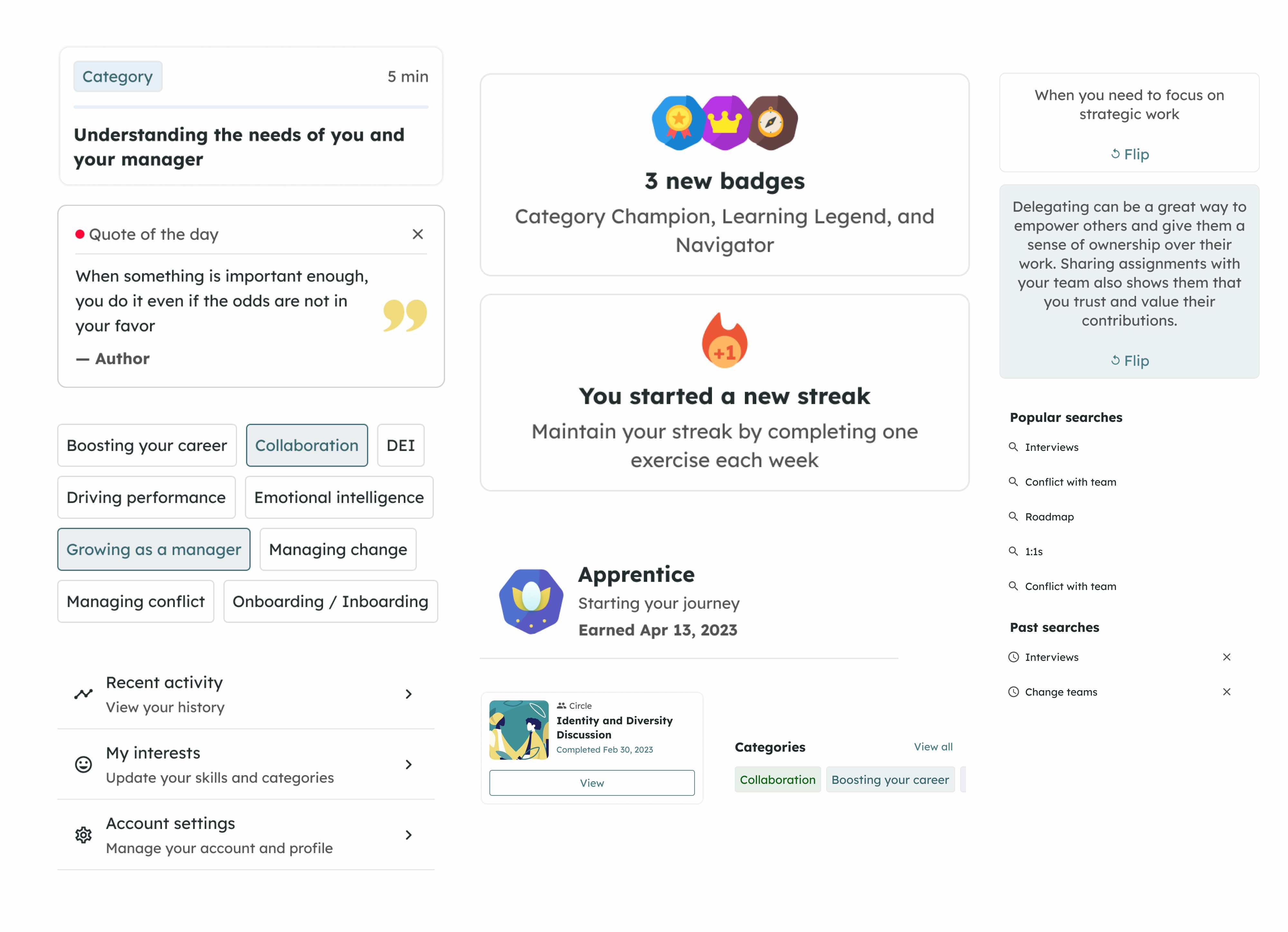
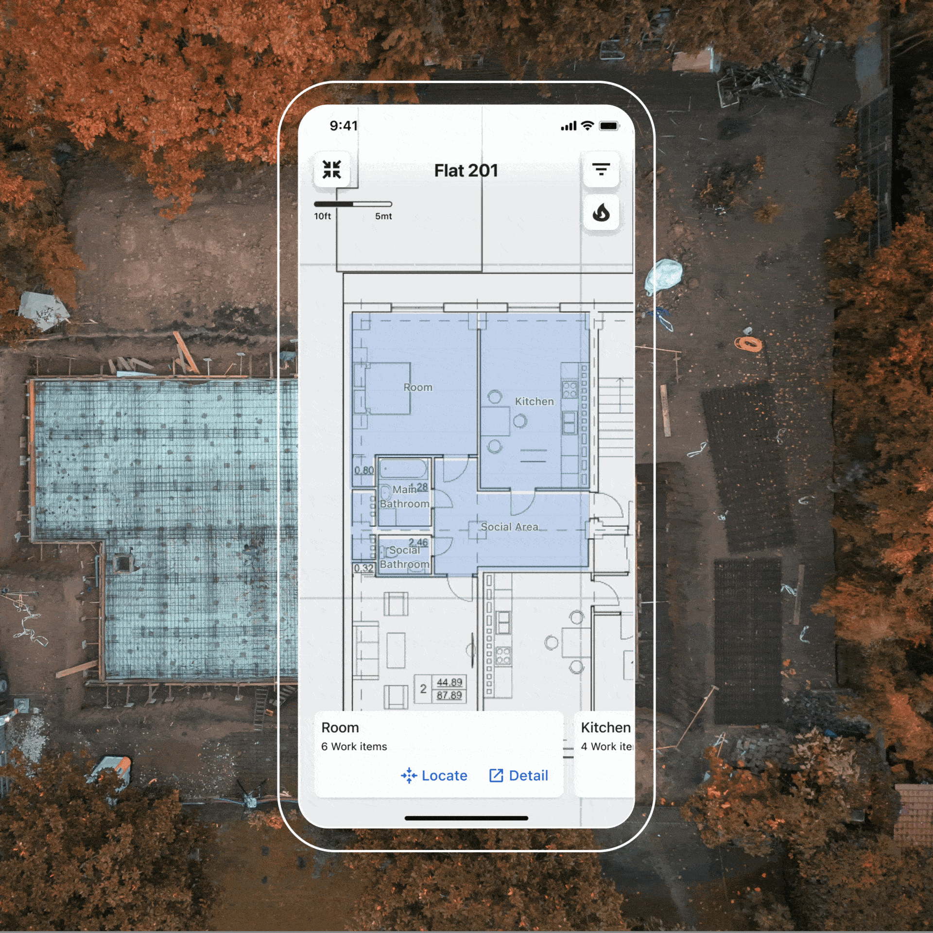
I needed to create a design system that ensure consistency across iPhone, iPad and Desktop environment.
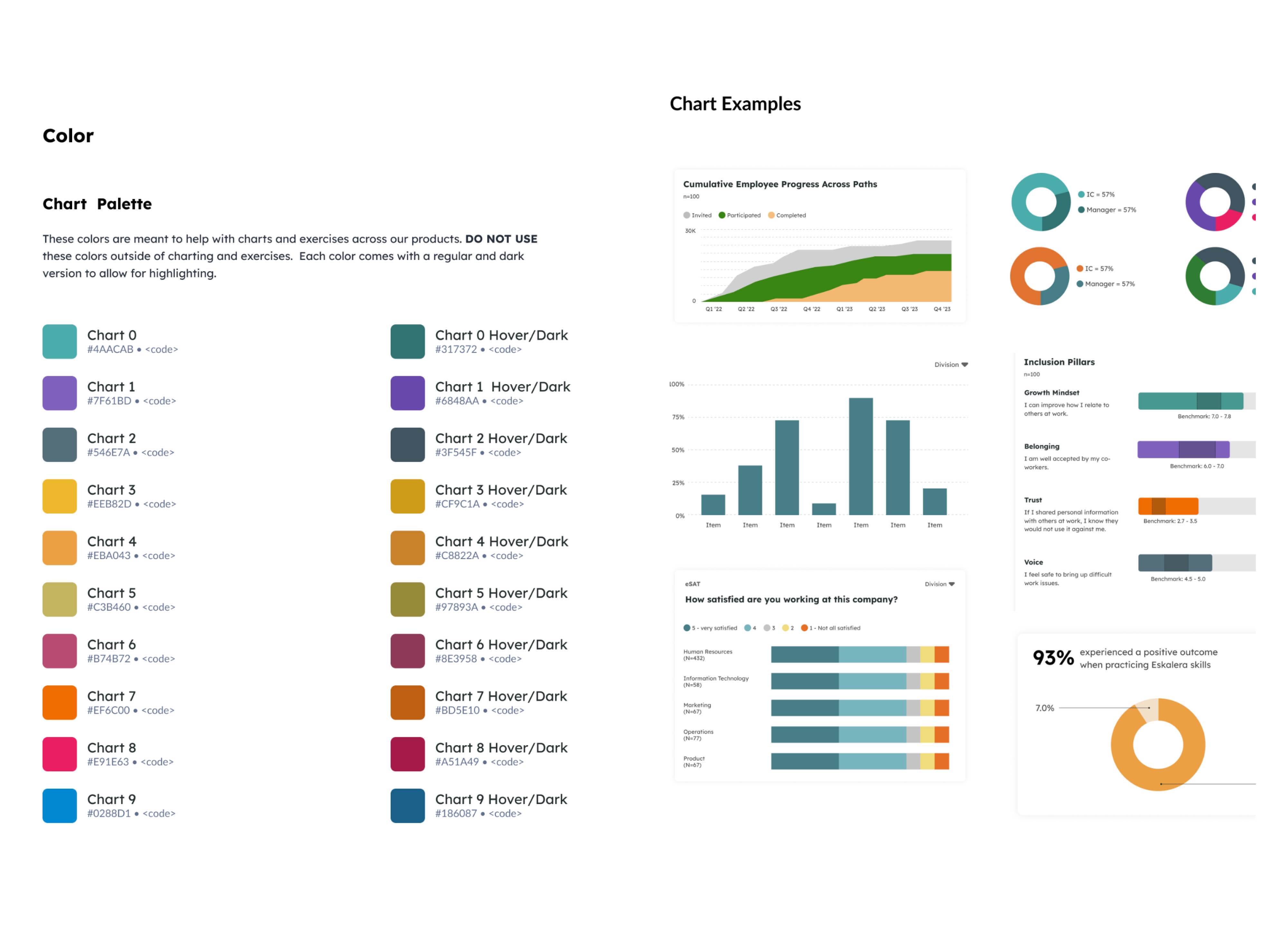
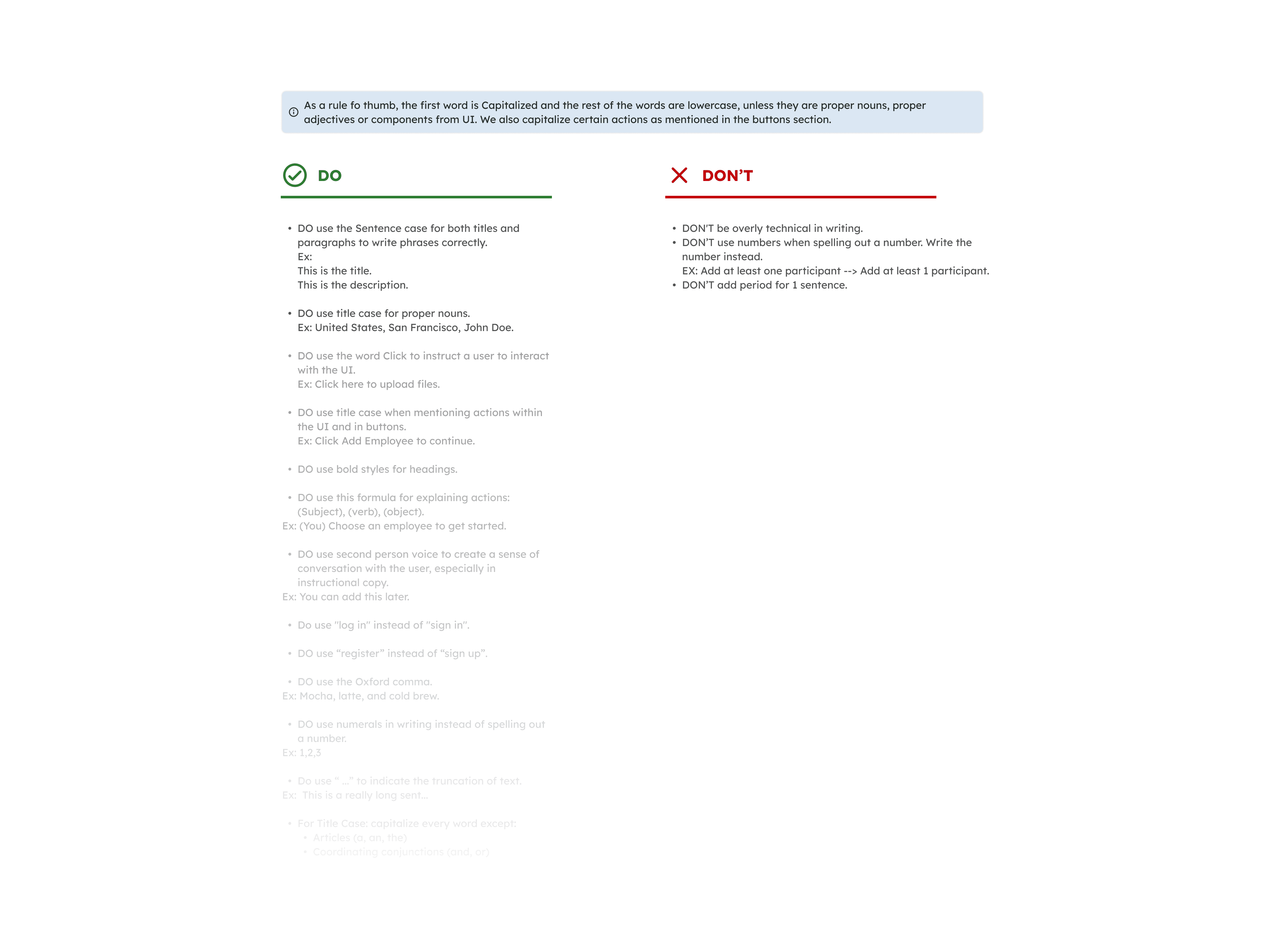
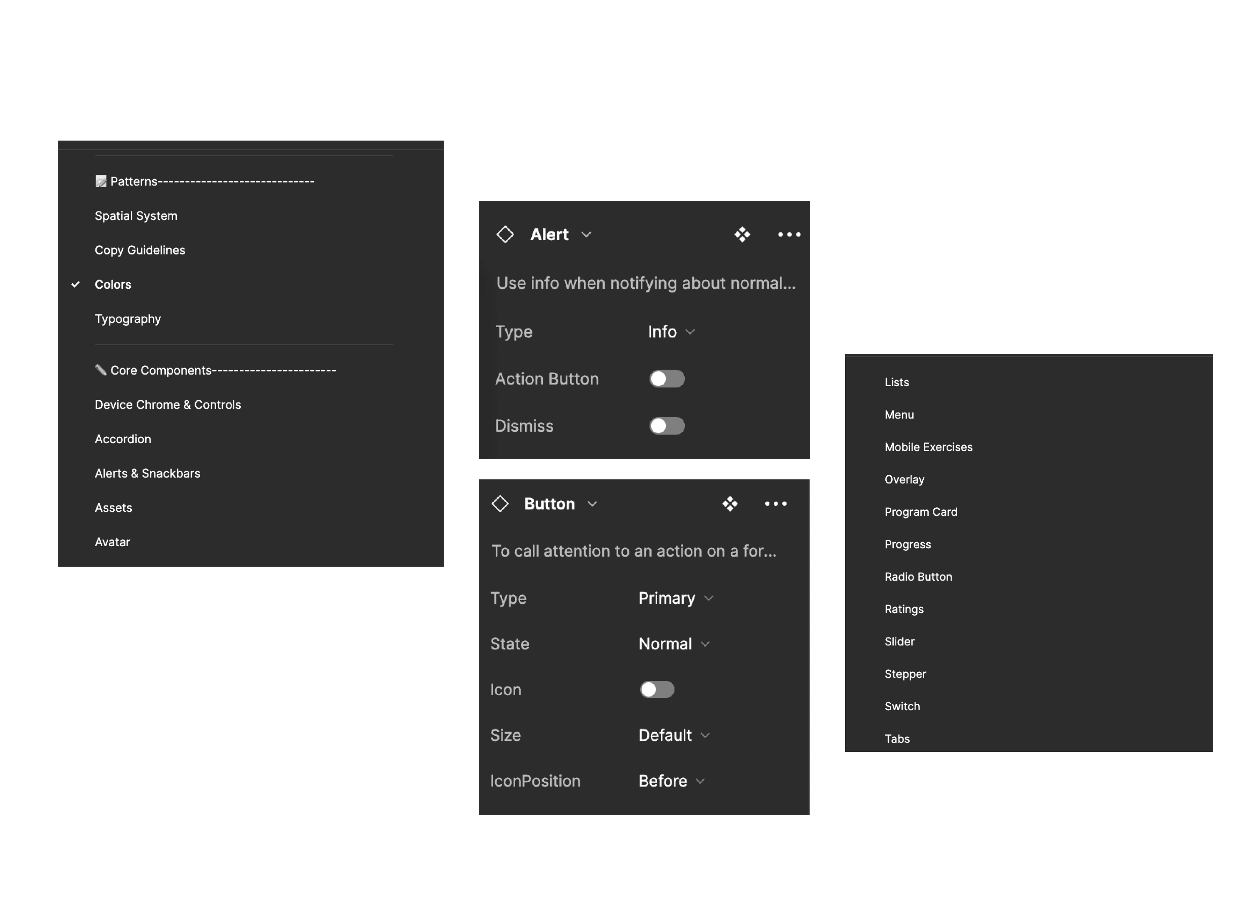
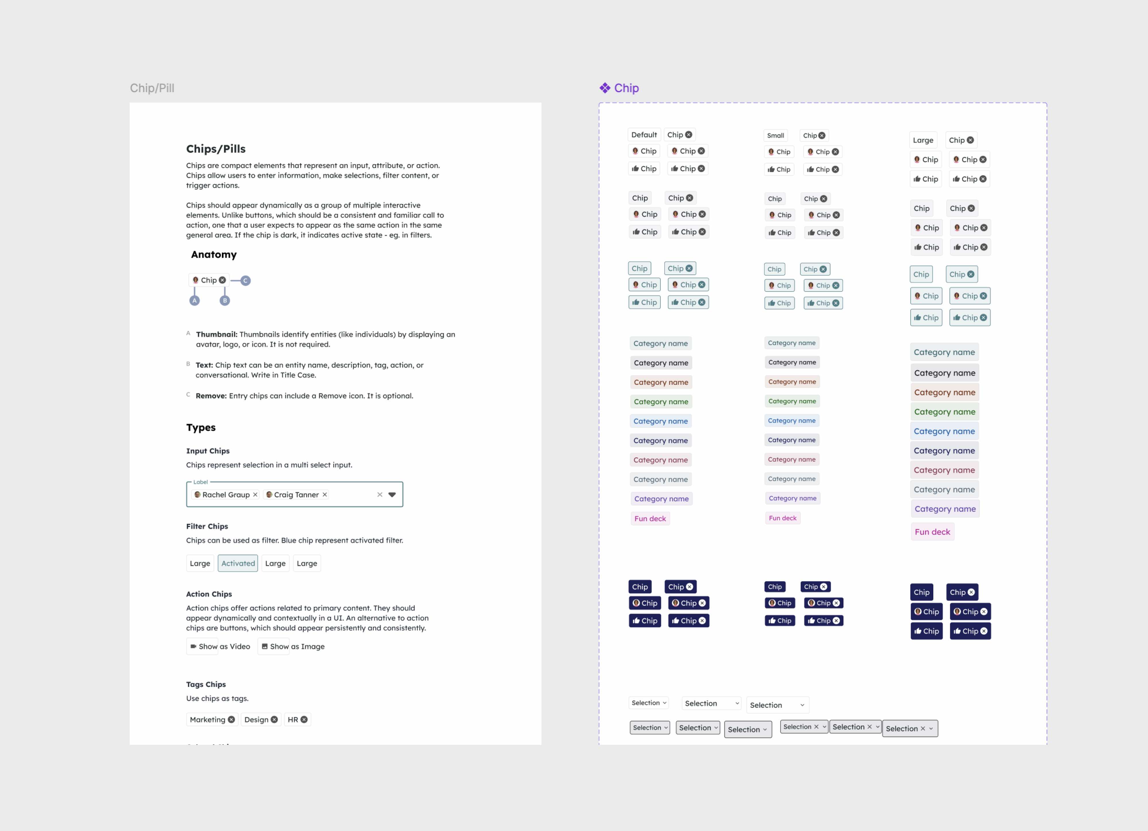
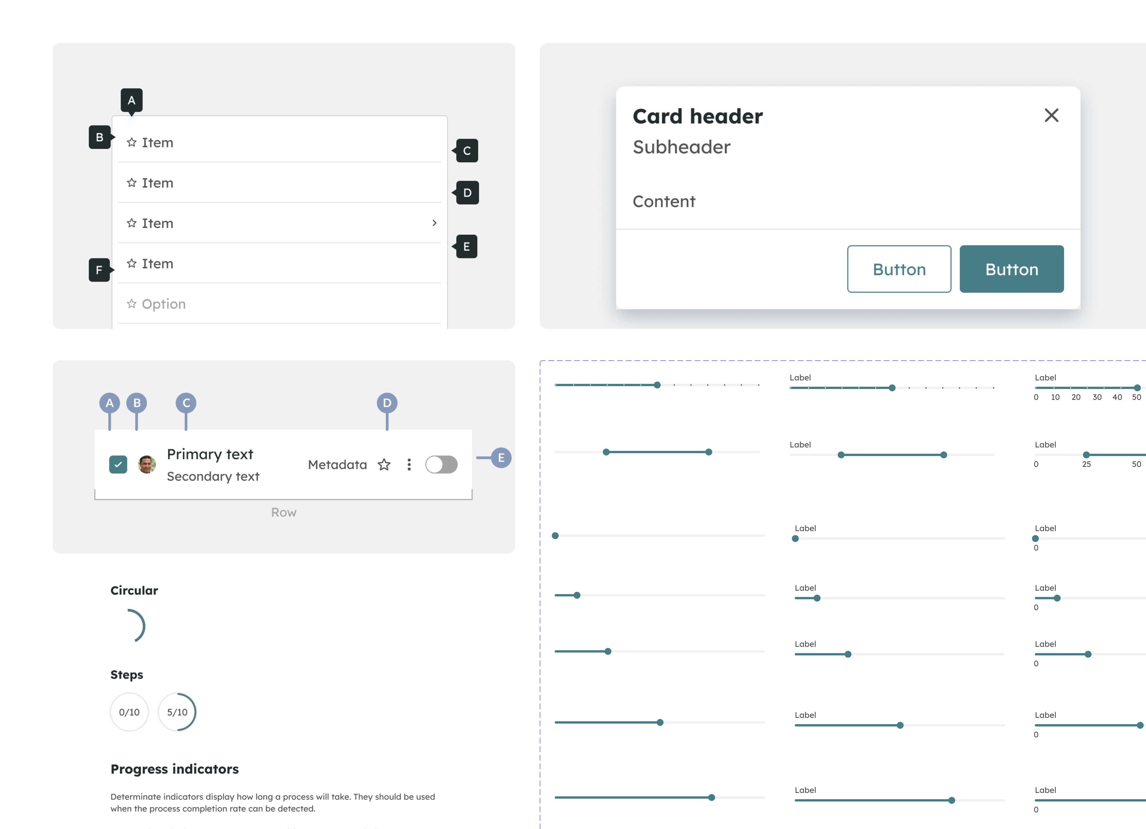
Variables
Each component would have variants and each variant would be correctly named so that when it came to publishing the components it made it easy to understand the state changes and what you can turn off and on to get the desired component.
Approach
I created the library from scratch. There was some help from Material UI Kit to get the ball rolling with some universal components such as avatars and chips.
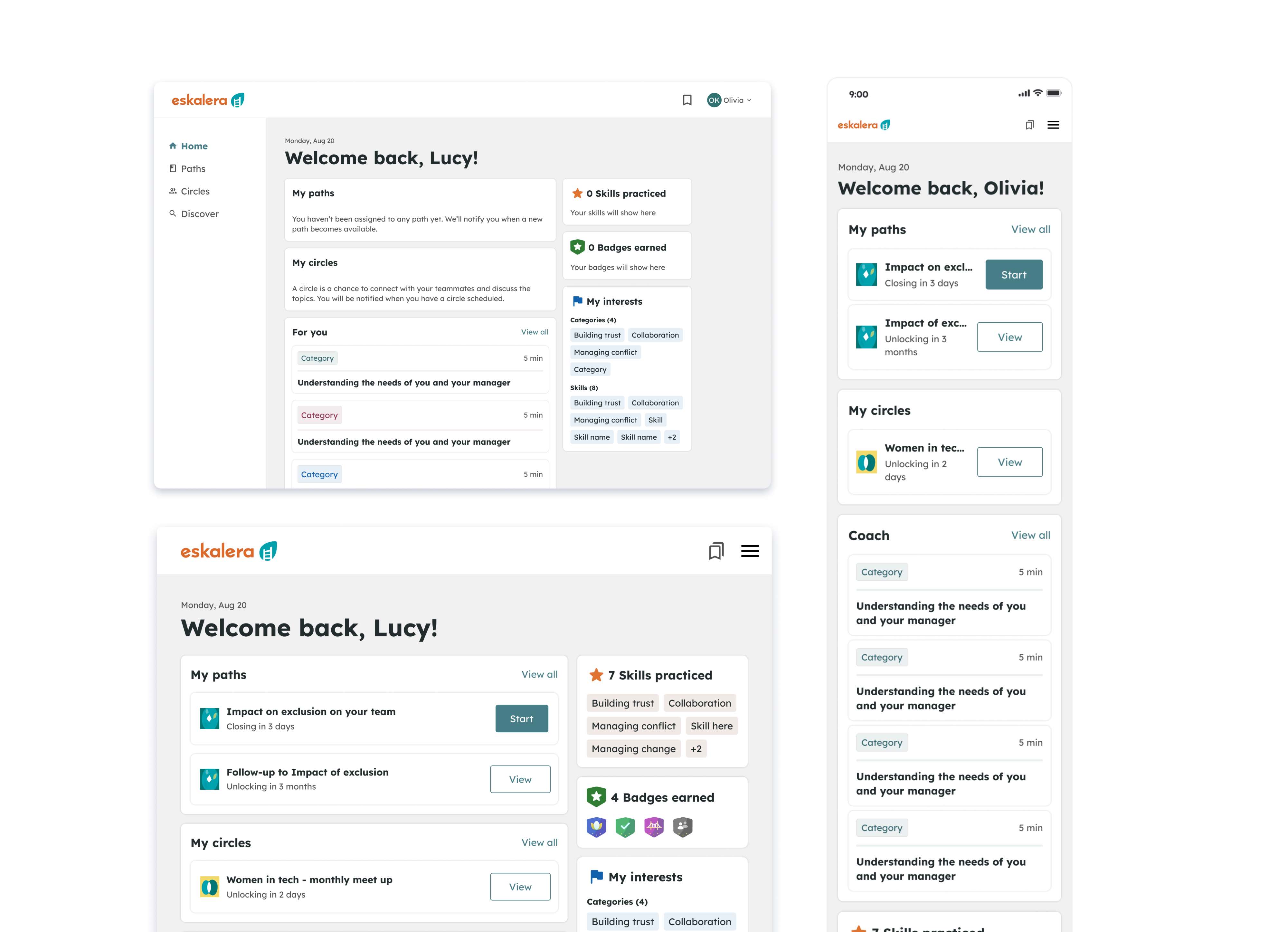
Devs were working on ionic for the mobile app and React for web app. It was a pretty straightforward project as the implementation was part of the redesign project we were working on. It was a matter of rebuilding the pages using the new components and styles.
Structure
All the pages have:
— Children components (were applicable) and parent components.
— A clear explanation for what this element is and how it is typically used, occasionally accompanied by dos and don’ts for context and clarification.
— Rules of when to use the component and how to use the component.
Key benefits
Skale became the single source to view components, patterns, and styles. It helps in-house designers and design partners focus less on tweaking visual appearance and more on complex problems and solutions. This ensures that the project and designs are consistent visually and functionally.
Impact
We immediately saw an increase in cohesion and decrease in rogue components, and a faster pace of iterative and early design work. The governance process I established created more opportunities for the team to work together, getting early visibility into how the system was emerging across the product. This visibility expanded as the dedicated front-end engineers started to pull the visual system into code.