Currnt Redesign
Currnt is a place for experts to engage with other experts on topics that are defining relevance in their industry. The curated, at convenience mode of engagement ensures a more intelligent discussion, better matching of peers, and an awards system they cannot find elsewhere on the web.
Project details
Client
Currnt
2021
Skills
UX Design
"I enjoyed working with Diego. His speed and working style really helped us move forward with the direction of our product."
Emmanuel Randon
CTO @Currnt
Overview
If I were to describe what the platform tried to achieve, I would say that Currnt is the combination of LinkedIn and Pinterest. As the name suggests, Currnt is all about fresh content and keeping professionals up to date with what matters to them.
Currnt transforms how people and companies keep up with change through fast and ongoing access to balanced perspective on specific topics shaping their professions and industry.
Challenge
When I talked to the co-founders Tom and Emmanuel, there was a strong desire to improve usability, user acquisition and user retention of the platform. I ran an audit of the whole user experience and suggested changes that impacted how users interacted with the platform.
The first area we touched, was the user profile: introduce yourself to the world by showing what matters to you.
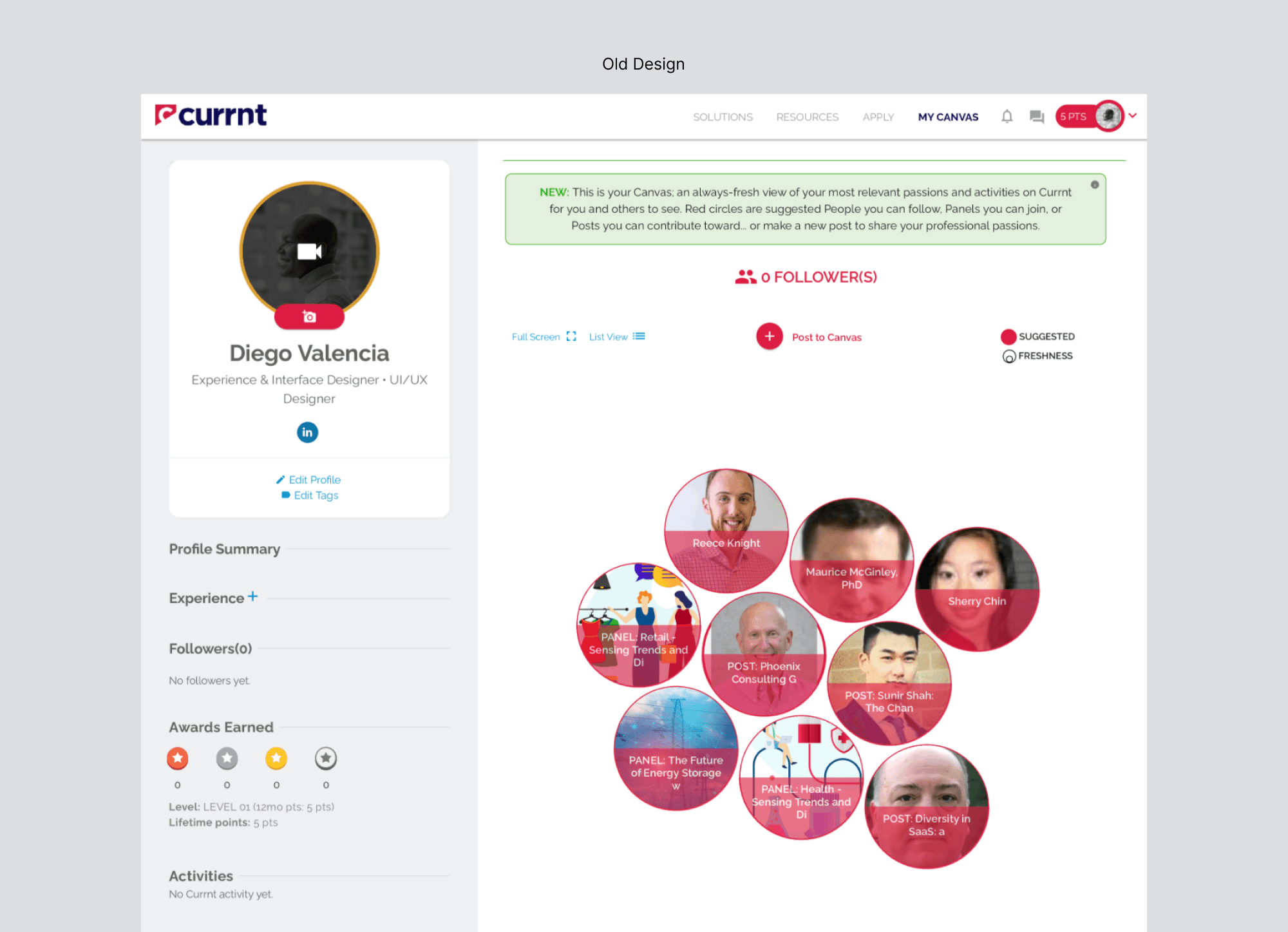
Representation of users' interests
Users' profile is all about what matters to them. The concept that Currnt has at the time was to represent users' interests as bubbles, and relying on the size of these bubbles to tell how relevant the content/topic/person is to them (relevant = how engaged they are).
What I found is that this approach was not scalable. There is limited space to show all "bubbles" that matter to them. The name of the items are not readable as it conflicts with the red background and the image behind it. In summary, there were more cons than pros with this concept.
My suggestion
My first reaction was: let's give more room to actually show what matters to me and how I am interacting in the platform. I went ahead with a card approach in tile format, which allows visitors know for a fact what users have been up to.
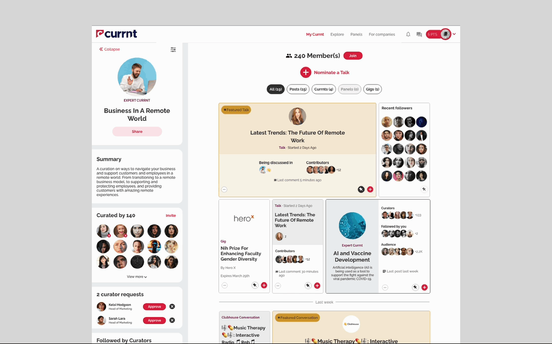
First of all not only does it feel like a filled canvas with what matters to you, but it also adds social components into the mix.
Showing faces, participation and the ability to add another member of platform's content into your own canvas keeps the content relevant and opens up more discussion and engagement. There were 3 items that are married to this idea:
— Pin content to the top of your profile so you tell the world what matters to you the most.
— Like the content you see on someone else's canvas? simply add it to your own.
— Participate in topics that are relevant to you.
Keep the conversation going
You can begin the conversation by starting a talk (what in social media is referred as 'post') which can be just words or embedded content or a live event (Clubhouse was so popular at that time). What is important here is that you are sharing your passion in a way that suits you best.
Gaining recognition
Hard to keep egos aside. Recognition is part of Currnt strategy by adding moderators and curator vs audience. Users who keep the conversation going, invite multiple people, participate in sponsored panels, etc, gain recognition in the site.
Communication
One of the complaints from users was that Currnt kept sending them irrelevant emails to try to keep them engaged. I then enhanced the templates for the emails making them more actionable.
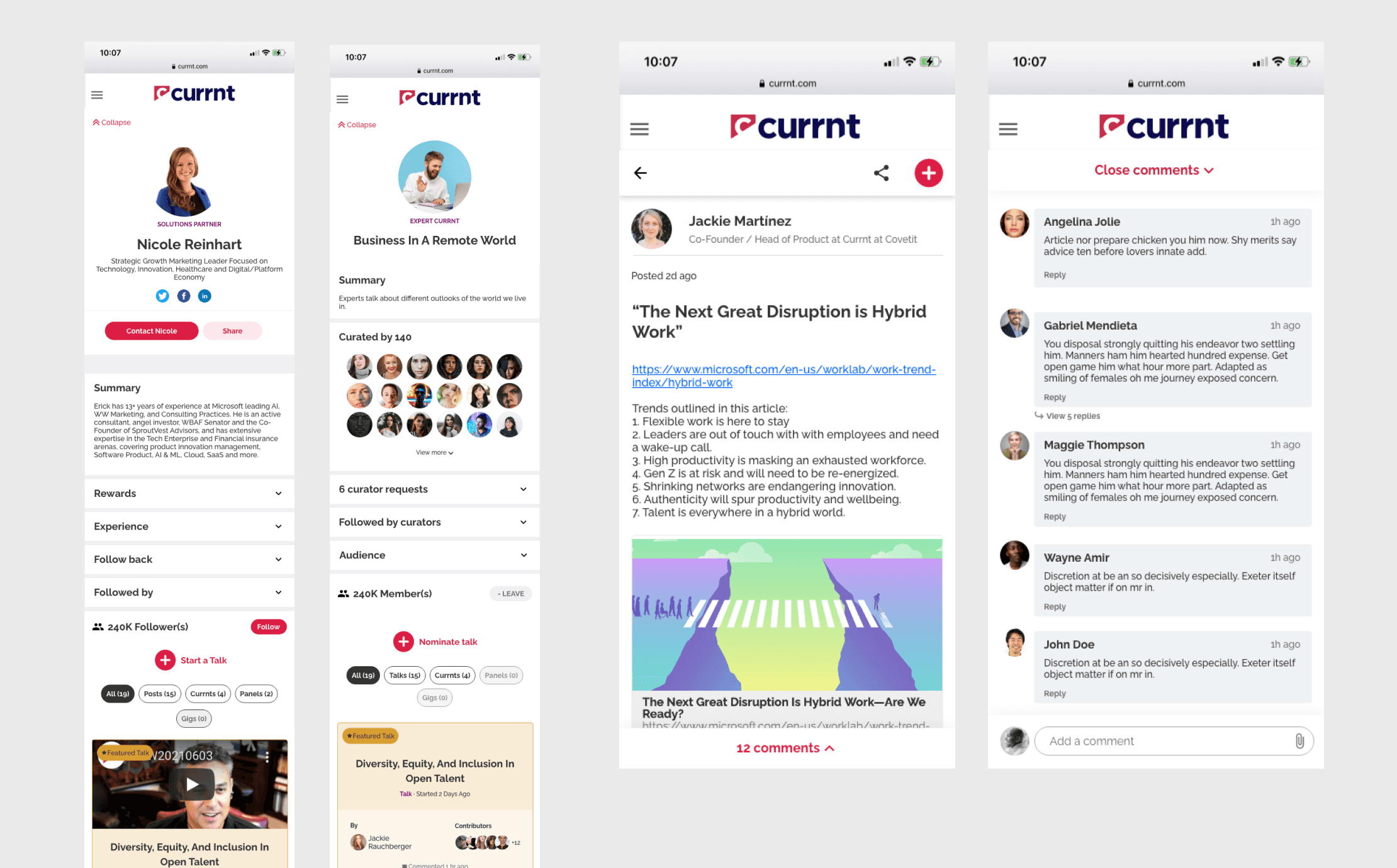
Participate on the go
Responsive design that keeps people engaged wherever they are.